


A website might look impressive on a desktop computer but still frustrate visitors using smartphones. Small text, oversized images, difficult navigation, and buttons that are hard to tap can quickly drive mobile users away. Understanding how to make a website mobile friendly is therefore essential for website owners, bloggers, businesses, and developers who want to provide a consistent experience across different devices.
A mobile-friendly website automatically adjusts its layout, content, images, and interactive elements to fit smaller screens. This approach is commonly known as responsive web design. However, creating a responsive layout involves more than reducing the size of desktop content. You also need to consider loading speed, readability, accessibility, navigation, and search engine requirements.
This guide explains practical ways to improve your website’s mobile experience, whether you use WordPress, a website builder, or custom HTML and CSS.
1. What Does It Mean to Make a Website Mobile Friendly?
A mobile-friendly website is designed to work properly on smartphones and tablets without requiring visitors to zoom in, scroll horizontally, or struggle with navigation.
For example, imagine someone visiting an online clothing store using a smartphone. They should be able to browse product images, read descriptions, select sizes, and complete a purchase without switching to a desktop computer.
A properly optimized mobile website should provide:
- Responsive layouts: Content automatically adjusts to different screen sizes.
- Readable typography: Visitors can comfortably read text without zooming.
- Simple navigation: Menus and links are easy to access.
- Touch-friendly buttons: Interactive elements have sufficient space.
- Optimized images: Pictures fit the screen without unnecessary loading delays.
- Fast performance: Pages load efficiently, even on slower connections.
- Accessible content: People with different abilities can navigate and understand the website.
The important distinction is that mobile-friendly design focuses on usability, not simply appearance. A website can technically fit a smartphone screen while still being difficult to use.
Use Responsive Web Design
Responsive web design is one of the most important techniques for creating a mobile-friendly website.
Instead of building completely separate websites for computers and smartphones, responsive design allows one website to adapt its appearance according to the available screen space.
For example:
- A desktop website might display three columns of blog articles.
- A tablet might display two columns.
- A smartphone might display one column.
The content remains available, but its arrangement changes to suit the device.
How Responsive Design Works
Responsive websites typically use three important techniques:
1. Flexible layouts
Flexible layouts use percentages, fractional units, and other relative measurements instead of relying entirely on fixed pixel widths.
For example:
.container {
    width: 90%;
    max-width: 1200px;
    margin: 0 auto;
}
This allows the container to adjust to the available screen width while maintaining a maximum size on larger displays.
2. CSS media queries
Media queries allow developers to apply different CSS rules depending on the browser’s viewport dimensions and other device characteristics.
For example:
/* Desktop layout */
.container {
    display: grid;
    grid-template-columns: repeat(3, 1fr);
    gap: 20px;
}

/* Mobile layout */
@media (max-width: 768px) {
    .container {
        grid-template-columns: 1fr;
    }
}
On smaller screens, the three-column layout changes into a single column.
3. Flexible images
Images should automatically adjust to their containers rather than extending beyond the screen.
img {
    max-width: 100%;
    height: auto;
}
This simple CSS rule prevents many common image overflow problems.
Modern CSS also provides tools such as Flexbox and CSS Grid, which make responsive layouts easier to build without creating separate designs for every device.
Add the Correct Viewport Meta Tag
One common reason websites fail to display properly on smartphones is a missing or incorrectly configured viewport meta tag.
The viewport tells the browser how to calculate the visible layout area of a webpage. Without the appropriate configuration, some mobile browsers may use a wider virtual viewport and scale the entire website down.
This can make text and buttons appear unnecessarily small.
To address this issue, include the following code inside the HTML document’s head section:
<meta name="viewport" content="width=device-width, initial-scale=1">Here is what the settings mean:
width=device-widthtells the browser to match the viewport width to the device’s width.initial-scale=1sets the initial zoom level to the normal scale.
This configuration helps responsive layouts and CSS media queries work as intended on mobile devices.
Most modern WordPress themes already include the viewport meta tag. However, if you are developing a custom website or working with an older theme, it is worth checking the page source.
One important accessibility consideration is to avoid disabling user zoom through restrictive viewport settings. Visitors with visual impairments may depend on zooming to read website content.
Improve Mobile Navigation and Menu Design
Navigation is another important part of mobile usability.
Desktop websites often have large horizontal navigation menus containing several categories, dropdowns, and additional links. These menus can become crowded when displayed on smaller screens.
A mobile website needs a more practical navigation structure.
Use a Simple Mobile Menu
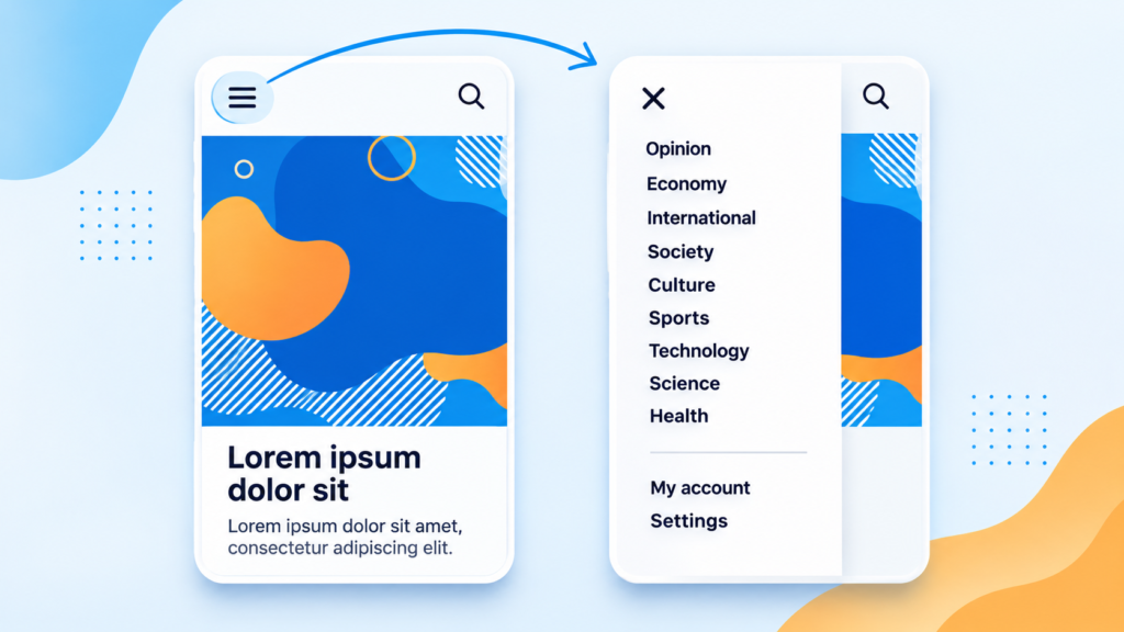
A hamburger menu is a common solution. It displays a menu icon that visitors can tap to open the navigation options.
A good mobile menu should:
- Display important categories clearly.
- Open and close reliably.
- Use readable text.
- Avoid complicated dropdown structures.
- Keep important links easy to reach.
- Allow visitors to close the menu without difficulty.
For example, a technology blog might organize its mobile navigation into categories such as Technology, Artificial Intelligence, Business, Reviews, and Tutorials.
Instead of displaying every category in a crowded header, the website can present them in a clean expandable menu.
Make Navigation Comfortable for Touchscreens
Smartphone visitors use their fingers rather than a mouse.
Therefore, links, menu icons, and buttons need sufficient clickable space.
Avoid placing multiple small links too close together. Give interactive elements enough spacing so visitors can select the intended option without accidentally tapping another one.
Also, make sure that important navigation elements remain visible and usable when the page is viewed in portrait or landscape orientation.

Optimize Images for Mobile Devices
Large images can significantly affect website performance, particularly for visitors using mobile data or slower internet connections.
For example, a desktop homepage might contain several high-resolution banners and featured images. Loading every image at its largest available size can waste bandwidth on smartphones.
Image optimization helps reduce this problem.
Use Modern Image Formats
Consider using modern image formats such as:
- WebP: Provides efficient image compression while maintaining good visual quality.
- AVIF: Can offer smaller image files at comparable visual quality, depending on the image and encoding settings.
- JPEG: Still useful for photographic images when modern formats are unavailable.
- SVG: Suitable for logos, icons, and scalable vector graphics.
The correct format depends on the image, browser support requirements, and website setup.
Resize Images Before Uploading
Avoid uploading unnecessarily large images when a smaller version will provide sufficient visual quality.
For example, if a blog’s featured image appears at approximately 800 pixels wide on the mobile layout, uploading a 5000-pixel-wide image may waste bandwidth.
However, do not reduce image quality so aggressively that photographs become blurry.
Use Responsive Images
HTML provides the srcset and sizes attributes, allowing browsers to select an appropriate image resource for the available display conditions.
Example:
<img
  src="image-800.jpg"
  srcset="
    image-400.jpg 400w,
    image-800.jpg 800w,
    image-1200.jpg 1200w
  "
  sizes="(max-width: 600px) 100vw, 800px"
  alt="Modern office workspace"
  width="1200"
  height="800"
>
This gives the browser different image sizes to choose from rather than forcing every device to download the same large file.
You can also use lazy loading for images that appear further down the page:
<img
  src="article-image.webp"
  alt="Website design example"
  loading="lazy"
  width="800"
  height="500"
>
Avoid applying lazy loading indiscriminately to important above-the-fold images, particularly the main image that determines the page’s Largest Contentful Paint.
Providing image dimensions also helps the browser reserve space before an image loads, reducing unexpected layout movement.
Improve Mobile Website Loading Speed
A responsive website is not necessarily a fast website.
A page can fit perfectly on a smartphone but still provide a poor experience if it takes too long to load or becomes unresponsive when visitors interact with it.
Performance optimization should therefore be part of every mobile-friendly design strategy.
Reduce Unnecessary Plugins and Scripts
Websites built with WordPress often use plugins for SEO, security, forms, analytics, page builders, and other features.
These tools can be useful, but installing unnecessary plugins may introduce additional CSS, JavaScript, database queries, and external requests.
Review your installed plugins and remove those that are genuinely unnecessary.
Also consider:
- Removing unused JavaScript and CSS.
- Minifying CSS and JavaScript where appropriate.
- Enabling browser caching.
- Using a suitable content delivery network (CDN).
- Compressing images.
- Reducing unnecessary third-party scripts.
- Choosing reliable hosting.
Understand Core Web Vitals
Google’s Core Web Vitals provide useful measurements of real-world website experience.
Three important metrics are:
| Metric | What It Measures | Good Target |
|---|---|---|
| LCP | Loading performance | 2.5 seconds or less |
| INP | Interaction responsiveness | Below 200 milliseconds |
| CLS | Visual stability | Below 0.1 |
These thresholds are assessed at the 75th percentile of page visits.
For example, LCP measures how quickly the largest visible content element appears. INP evaluates how quickly a page responds to user interactions. CLS measures unexpected layout movement.
Website owners can use performance testing tools and Google Search Console to identify problems.
Remember that improving these metrics requires identifying the actual problem. Installing another caching plugin will not necessarily fix an oversized hero image, a slow server response, or heavy JavaScript.
Make Website Text Easy to Read on Smartphones
Typography can have a major effect on mobile usability.
Text that looks comfortable on a large desktop monitor may become difficult to read on a smartphone, particularly when the font is too small or paragraphs extend across the available screen.
A mobile-friendly website should use readable font sizes, appropriate line spacing, and comfortable paragraph widths.
Recommended Typography Practices
Consider the following guidelines:
- Use approximately 16px as a starting point for normal body text.
- Choose a font that remains readable at smaller sizes.
- Keep sufficient contrast between text and background.
- Avoid unnecessarily long paragraphs.
- Use clear H2 and H3 headings to organize information.
- Maintain comfortable spacing between paragraphs.
- Avoid decorative fonts for important website content.
You can also use CSS clamp() to create flexible typography.
h1 {
    font-size: clamp(28px, 5vw, 44px);
}

p {
    font-size: 16px;
    line-height: 1.7;
}
The clamp() function allows the font size to adjust within defined minimum and maximum values.
For a blog or magazine website, this is particularly useful because visitors often read lengthy articles on smartphones.
Avoid using excessively large headings that occupy most of the visible screen. The goal is to establish a clear content hierarchy without making visitors scroll through unnecessary space.
Make Forms, Buttons, and Other Interactive Elements Mobile Friendly
A website may look excellent on mobile but still lose visitors when its forms or buttons are difficult to use.
This is particularly important for e-commerce websites, service businesses, and websites that collect customer enquiries.
Imagine a visitor trying to purchase a product using a smartphone. If the Add to Cart button is too small, the quantity selector is difficult to operate, or the checkout form requires excessive typing, the shopping experience becomes frustrating.
Improve Button Design
Mobile buttons should:
- Have sufficient height and width.
- Include clear action labels.
- Provide enough spacing from nearby elements.
- Use contrasting colours.
- Display a visible response when tapped.
For example, buttons labelled “Buy Now,” “Add to Cart,” and “Contact Us” are more useful than unclear labels.
Simplify Contact and Checkout Forms
Avoid asking visitors for unnecessary information.
For mobile forms, consider:
- Using appropriate input types, such as
emailandtel. - Keeping labels visible.
- Displaying helpful error messages.
- Using suitable autocomplete attributes.
- Grouping related fields.
- Making dropdowns easy to operate.
- Providing clear submission confirmation.
Where possible, use a single-column form layout on smartphones.
These improvements reduce friction and make important website actions easier to complete.
Remove Mobile Design Problems That Affect User Experience
Some website elements work reasonably well on desktops but create serious usability problems on smartphones.
Identifying and correcting these issues can make a noticeable difference.
Here are some common problems to check.
Horizontal Scrolling
Visitors should generally be able to read ordinary website content without scrolling sideways.
Horizontal overflow often happens because of:
- Fixed-width containers.
- Oversized images.
- Wide tables.
- Long unbroken text.
- Incorrectly positioned elements.
- Desktop layouts that have not been adapted for mobile.
For example, a content section with a fixed width of 1200px cannot comfortably fit inside a narrow smartphone viewport.
Use flexible widths and test individual elements to identify the cause.
Intrusive Popups
Large promotional popups can cover the entire mobile screen and make it difficult for visitors to access the main content.
If you use newsletter subscriptions, promotional banners, or advertising popups, make sure visitors can close them easily.
Avoid displaying multiple overlapping popups or forcing users to interact with an advertisement before reading an article.
Oversized Headers
Desktop headers sometimes contain large logos, multiple navigation rows, social icons, and promotional banners.
On mobile, these elements can occupy too much vertical space.
Use a compact header that gives visitors quick access to the logo, menu, and essential actions.
Poorly Displayed Tables
Tables can become difficult to read on smaller screens.
If a table contains many columns, consider simplifying the information, using stacked content, or allowing horizontal scrolling within the table container rather than across the entire webpage.
The objective is to preserve useful information without breaking the mobile layout.
How to Make a WordPress Website Mobile Friendly
WordPress makes mobile optimization relatively straightforward because many modern themes and page builders already include responsive design features.
However, choosing a responsive theme does not guarantee that every page, widget, image, or interactive element will work correctly on smartphones.
If you manage a WordPress blog, magazine, business website, or online store, follow these practical steps.
Step 1: Choose a Responsive WordPress Theme
Start with a theme that supports responsive layouts.
Examples include:
- Astra
- GeneratePress
- Kadence
- Blocksy
- Hello Elementor
These themes provide different design approaches and customization options.
Before choosing one, check its mobile navigation, typography, layout controls, compatibility with your plugins, and performance.
Step 2: Configure Mobile Settings in Elementor
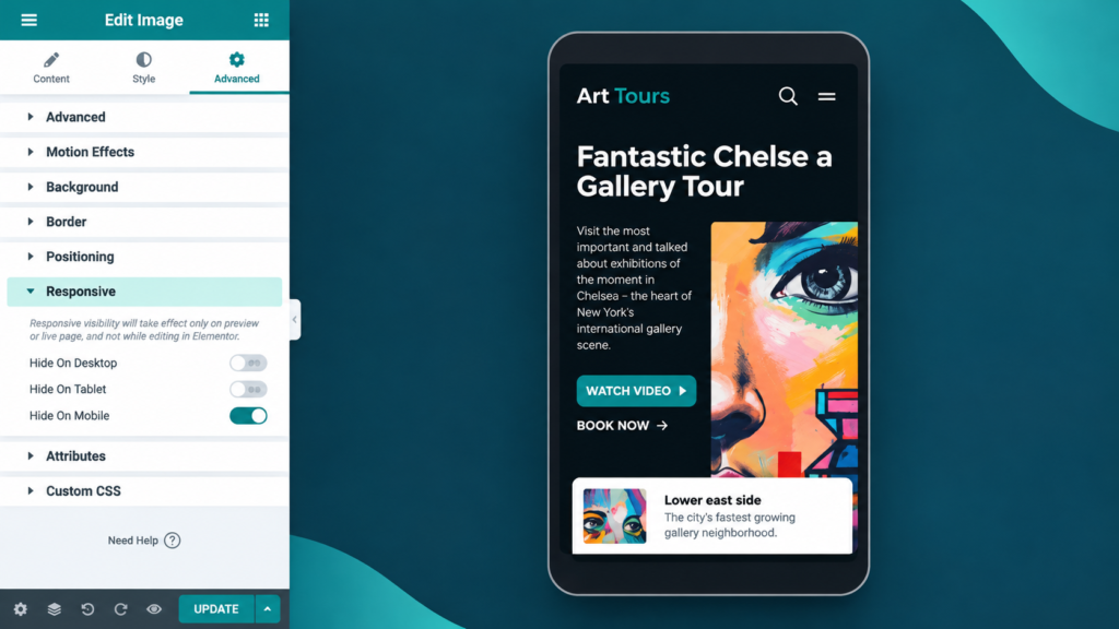
If you use Elementor, its responsive editing controls allow you to adjust layouts for different screen sizes.
To access these options:
- Open a page using Elementor.
- Select the Responsive Mode icon.
- Choose Desktop, Tablet, or Mobile.
- Select an individual widget or section.
- Adjust its width, padding, margin, alignment, and typography.
- Preview the changes before updating the page.
For example, if a desktop section contains three columns, you can change it to one column on mobile.
You can also adjust mobile-specific font sizes and hide decorative elements that are unnecessary on smaller screens.
However, avoid hiding important content simply to make the design look cleaner.
Step 3: Optimize WordPress Images
Use appropriately sized images and modern formats such as WebP where supported.
You can also use image optimization tools to compress existing media files.
Check featured images, homepage banners, logos, and images inside blog posts.
Make sure that images maintain their proportions and do not create horizontal scrolling.
Step 4: Review Your Plugins
Check whether your installed plugins are adding unnecessary scripts or styling problems.
Pay particular attention to:
- Popup plugins.
- Slider plugins.
- Social sharing widgets.
- Advertisement plugins.
- Third-party tracking scripts.
- Page builder extensions.
Disable unnecessary functionality and test your website after making changes.
Step 5: Test Important Website Pages
Do not test only the homepage.
Check different page types, including:
- Homepage.
- Blog archive pages.
- Individual articles.
- Category pages.
- Contact forms.
- Search results.
- Product pages.
- Checkout pages.
A WordPress website can have a responsive homepage while its article templates or checkout pages still contain mobile usability problems.
Step 6: Test Before Publishing Changes
After making design adjustments, clear the relevant website and browser caches.
Then revisit the website on an actual smartphone.
Pay attention to menu behaviour, image display, scrolling, buttons, and page loading.
A final real-device test can reveal issues that are easy to miss inside a page builder’s preview mode.
How to Test Whether Your Website Is Mobile Friendly
Testing is essential because a website may behave differently across screen sizes, browsers, and devices.
Fortunately, several tools can help identify problems.
How can I check the PageSpeed of my website with tools? – SISTRIX
1. Google PageSpeed Insights
Use this tool to analyze page performance, Core Web Vitals data when available, and optimization opportunities.
Mastering Responsive Testing with Browser Developer Tools
2. Chrome DevTools
Use device emulation to inspect layouts at different viewport widths and identify responsive design issues.
How to improve Core Web Vitals | Contentful
3. Google Search Console
Review the Core Web Vitals report to understand how your website performs for real users and identify groups of URLs with problems.
Multi-Device Testing in a single tab with BrowserStack Live | BrowserStack Docs
4. BrowserStack
Use cross-browser and real-device testing to examine how a website behaves across different mobile devices and browsers.
What Should You Check During Testing?
Use this practical checklist:
- Website content fits the screen without unnecessary horizontal scrolling.
- Navigation menus open and close correctly.
- Text is readable without zooming.
- Images resize without becoming distorted.
- Buttons are easy to tap.
- Forms work properly on smartphones.
- Important content appears without unnecessary delays.
- Advertisements do not cover the main content.
- Videos and embedded content fit the available space.
- Website layouts work in portrait and landscape orientations.
- Important pages maintain consistent navigation and design.
- Visitors can zoom in when needed.
One important distinction: Google’s former standalone Mobile-Friendly Test was retired in December 2023. Today, PageSpeed Insights, Search Console, browser developer tools, and real-device testing are more useful options for evaluating mobile usability and performance.
Why Mobile-Friendly Websites Matter for SEO
Mobile optimization is important not only for visitors but also for search engine visibility.
Google uses mobile-first indexing, meaning it primarily uses the smartphone version of website content for indexing and ranking.
This makes it important to ensure that the mobile version contains the same essential information as the desktop version.
Maintain Consistent Content
Some website owners remove important sections from mobile pages to simplify the design.
However, removing article content, internal links, headings, or other important information can create differences between desktop and mobile versions.
Instead, consider using expandable sections or accordions when appropriate.
The content should remain accessible to visitors and search engines.
Optimize Mobile Metadata
If you use separate mobile and desktop versions of a website, check that important metadata is equivalent across both versions.
This includes:
- SEO titles.
- Meta descriptions.
- Structured data.
- Image alt text.
- Important page headings.
Responsive websites generally avoid this complication because they serve the same underlying content and metadata across screen sizes.
Improve Page Experience
Mobile visitors should be able to access information without excessive advertisements, intrusive popups, or confusing layouts.
Good Core Web Vitals, secure connections, accessible content, and effective navigation all contribute to a better overall page experience.
However, mobile optimization alone does not guarantee higher Google rankings. Content quality, relevance, technical accessibility, and other search systems also matter.
Frequently Asked Questions (FAQs)
1. How can I make my website mobile friendly?
Use a responsive theme or layout, optimize images, add the correct viewport meta tag, improve navigation, and make buttons and text comfortable to use on smartphones.
2. Can I make my existing website mobile friendly?
Yes. You can update your existing theme, adjust CSS, improve page layouts, and optimize images without necessarily rebuilding the entire website.
3. Is responsive design important for SEO?
Yes. Google recommends responsive design and uses mobile-first indexing, making it important to provide accessible and equivalent content on mobile devices.
4. How do I check whether my website is mobile friendly?
Use Google PageSpeed Insights, Chrome DevTools, Google Search Console, and real smartphones to identify layout, usability, and performance problems.
5. Does Elementor support mobile responsive design?
Yes. Elementor includes responsive editing controls that allow you to adjust layouts, spacing, typography, and other design settings for desktop, tablet, and mobile screens.
6. What is the ideal mobile website loading speed?
There is no single loading-time target for every website. However, Google’s recommended good Core Web Vitals include LCP of 2.5 seconds or less, INP below 200 milliseconds, and CLS below 0.1.
7. Does a mobile-friendly website need a separate mobile version?
No. Responsive web design allows one website to adapt to different screen sizes. Google generally recommends this approach because it is easier to maintain.
Conclusion
Learning how to make a website mobile friendly is an important part of building a successful website. A responsive layout is a good starting point, but genuine mobile optimization requires attention to several areas, including navigation, typography, image sizes, loading performance, accessibility, and interactive elements.
If you use WordPress, begin by checking your theme and Elementor settings before making major changes. Then optimize your images, review unnecessary plugins, and test important pages on actual smartphones.
Most importantly, evaluate your website from a visitor’s perspective. Can someone comfortably read an article, find a category, complete a form, or purchase a product without struggling? If the answer is yes, you are moving in the right direction. A well-optimized mobile website should make every important action simple, regardless of the device being used.





1 comment on “How to Make a Website Mobile Friendly: A Complete Guide”